Index

Markerless Learn Demo - Documentation
v1.0 (doc version)
19 August 2019
Description of Project#
This document is to explain the process of making an application using AR Foundation (Unity’s Markerless AR plugin using ArCore and ArKit) along with the Appearition SDK. The modules of the EMS that will be used are the AR Experience module, as well as the Learn module.
We will be covering how to implement AR Foundation in your project, but do note that based on Unity’s updates, the implementation may change. We will also be covering the Learn Module in detail, as well as how we bound it together with the AR Experience module, and why.
If you are comfortable with Unity, how to set up AR Foundation and the sample project, head over to 2.0 – Markerless Learn Demo Setup.
Requirements#
Before getting started with this sample project, we recommend to check out the tutorials regarding the EMS and SDK, located under Appearition/Examples/Turorials.
In order to go through this project, you will need:
-
Unity 2018.4 LTS or newer
-
AR Foundation 1.5.0 (or newer, though its API may change and not work)
While not a requirement, this sample project requires an intermediate level of understanding of both Unity and the EMS. If you are new to developing with Appearition, we recommend you check out other Sample Projects like the AR Demo first.
1.0 - Setting up the project#
1.1 – Setting up the Unity Editor#
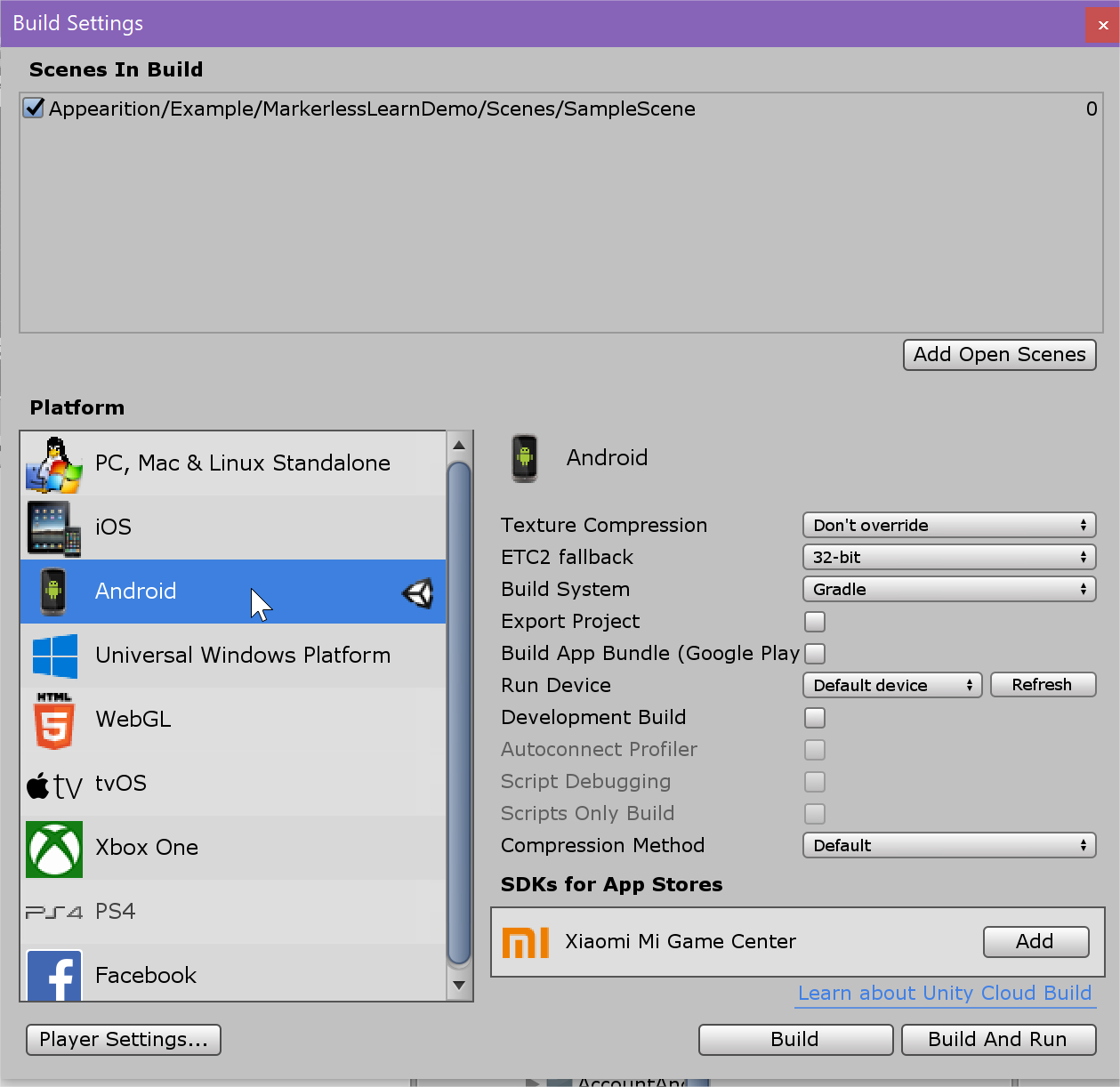
For us to work with this Sample Project, we will need to start by switching to Android Build Target, or IOS depending on what platform you’re targeting. In the Build Settings (CTRL+SHIFT+B or File > Build settings).
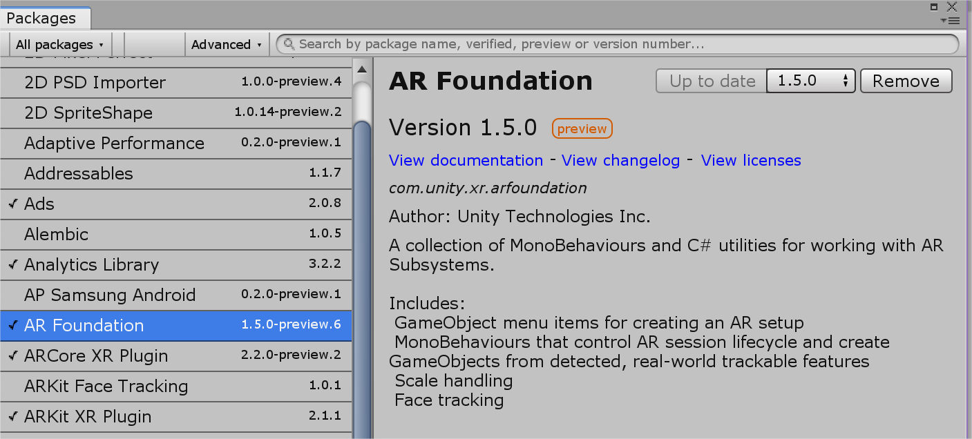
Secondly, we will need to head over to the Package Manager (Window > Package Manager), where we will find ArCore, ArKit and AR Foundation. If you are building only for Android, you won’t need ArKit, and if you are building only for IOS, you won’t need ArCore.
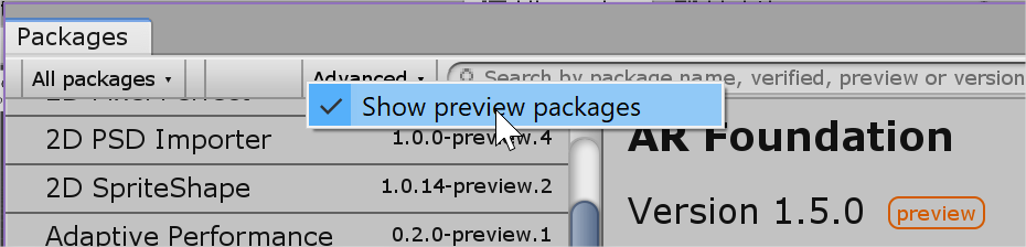
If you are unable to see AR Foundation, click on Advanced > Show Preview Packages, like so.
Install the required packages before moving on to next step.
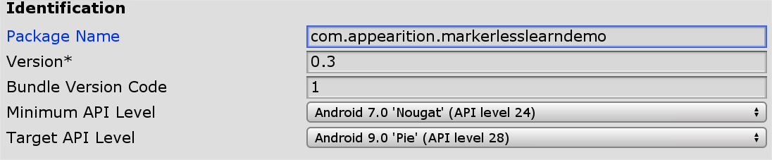
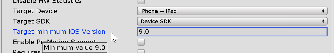
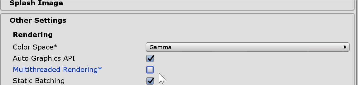
For both Android and IOS, you will be needing a Package Name. Head over to the Player Settings (File > Build Settings > Player Settings). Additionally, ArCore requires minimum API of 24 (7.0), and ArKit requires a minimum IOS version of 11.0. Lastly, Multithreaded Rendering must be turned off.
That is all you need to get started.
1.2 – Test the project#
Now that the editor is setup, you may extract the package located under Appearition/Examples/SampleProjects/MarkerlessLearnDemo_vX.X.unitypackage, if you haven’t already done so.
Because this project is using ArCore / ArKit, you won’t be able to test it in the editor and must be making a build on your chosen device. Ensure that your device has access to internet, preferably WIFI since data will be downloaded from the EMS.
The flow of the application is the following:
-
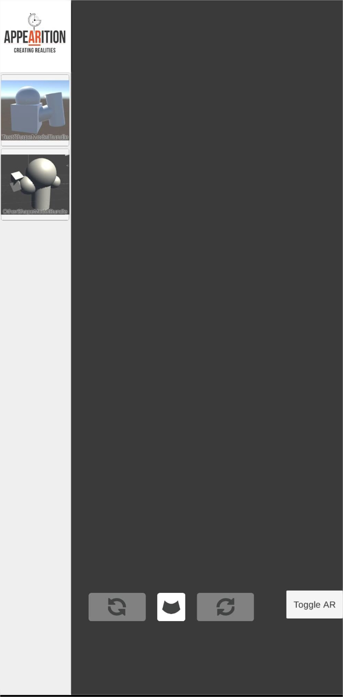
You will be greeted by a loading screen.
-
Once complete, you will arrive in menu where you are able to select the ModelBundle you want to choose. Those will be explained later.
-
Upon selecting, you will be able to manipulate the model.
-
Use one finger to rotate the model.
-
Use two fingers to move and scale the model.
-
Use the arrows to rotate clockwise and counterclockwise the model in the 3rd axis.
-
Use the middle UI button to reset the model to its original state.
-
-
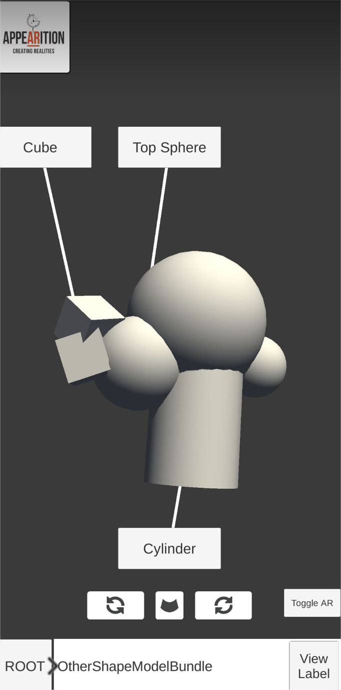
You will also be able to navigate through the model.
-
Tap once to highlight a model node.
-
Tap on a highlighted node to navigate into it, displaying its children nodes individually. If the newly selected node had a mesh, it will become transparent. If the node doesn’t have parents, by default, it will not be selected and nothing will happen.
-
Tap on the ROOT button to come back to the ModelBundle’s main view.
-
Tap on the node name to select the parent node, if any.
-
-
You will be able to see labels on each node, with the node’s display name.
-
Those labels will re-arrange themselves based on what the closest node is.
-
Upon manipulation, they will temporarily hide.
- This option can be toggled off later on.
-
-
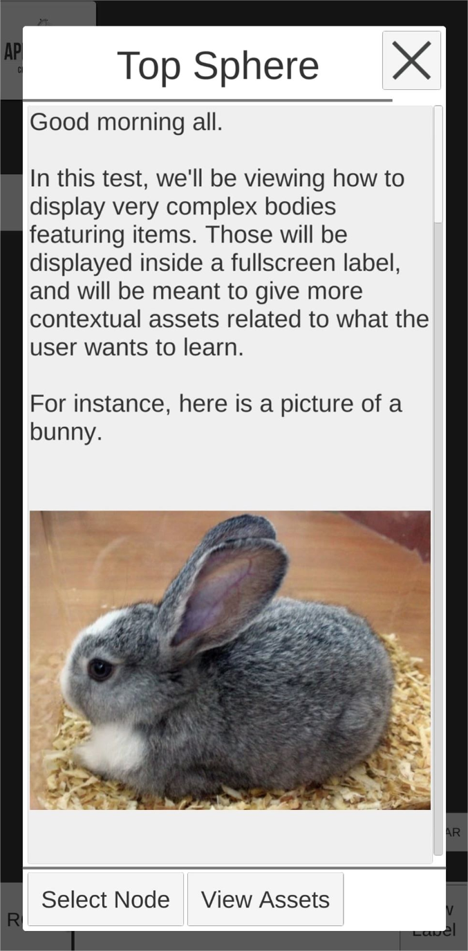
Upon clicking on the Label of a node, you will be able to see the content of its label.
-
Medias may be embedded inside the label. Those will be covered later on.
- Some of the medias may be interactable.
-
You can select the node currently viewed with a button.
-
You can view the assets associated with this node, if any, in a popup UI.
-
-
You can view the same content as mentioned above in Markerless AR Mode by clicking on the Toggle AR button.
- A Reset AR button will be available. It will reset the position of the model to somewhere in front of your phone facing forward.
Do note that the content might change from the screenshots below.
Next, we will be going over how to set up your content as part of the Sample Project.
2.0 – Markerless Learn Demo Setup#
The Appearition SDK usually relies on a single prefab to work: The AppearitionManager. In the case of the Markerless Learn Demo, we’ll be using a slightly modified one, which includes more components. It can be found under Appearition>Example>MarkerlessLearnDemo>Prefabs, and is called AppearitionManager_MarkerlessLearnDemo.
The main difference between the two of them, is that the AppearitionManager_MarkerlessLearnDemo contains utilities related to this sample project in particular, including scripts, cameras, default values, etc.
Do also note that the UI used in the sample scene has been saved in a prefab inside Appearition>Example>MarkerlessLearnDemo>Prefabs> MarkerlessLearnDemoSampleUI, and can be dropped in your scene as well. The only connection that may be required is connecting the AR Camera to the MarkerlessLearnLabelHolder’s Canvas (Event Camera) and Label UI Handler (Camera Ref) scripts.
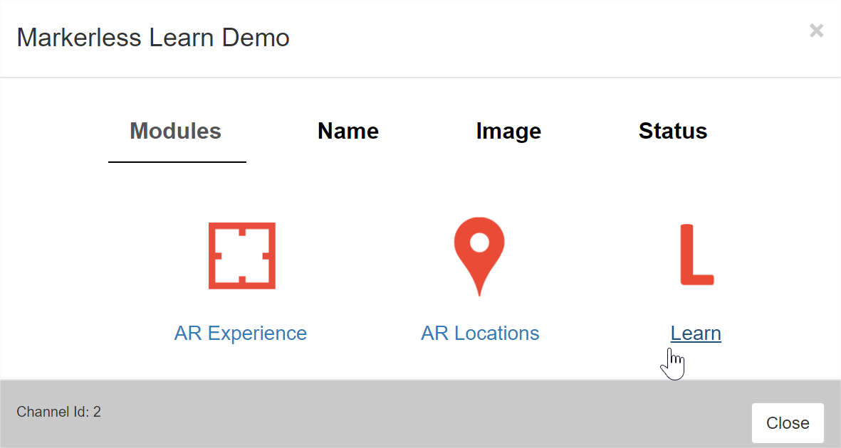
2.1 – Introduction to the EMS Learn Module#
This sample project requires both the AR Experience and Learn modules. If your channel selection doesn’t contain both, please contact Appearition Support, since the Learn module may not be enabled by default.
In our case, this channel also contains the AR Location module, which isn’t required for this sample project.
2.2 – ModelBundle Setup#
Essentially, ModelBundles is a mediatype based on an AssetBundle that we will be using specifically for this sample project. Do note that all the rules related to AssetBundles apply, including:
-
For each target platform, you will need an ModelBundle built for that specific platform. The MediaType used will be slightly different, for instance, Android ModelBundles use the modelbundle_Android name.
-
There must not be any additional / modified code used in a ModelBundle since the compile state of when that ModelBundle was created.
-
You can include any component and script on the ModelBundle as long as your application has those same scripts with the same version.
-
If the any of the scripts are modified, you may need to rebuild the ModelBundles.
-
-
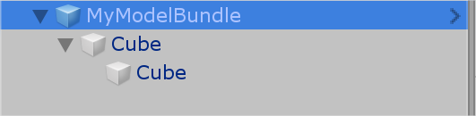
For the sake of using them within our sample projects, we only want one single GameObject at a root of an AssetBundle.
-
The name of the Experience needs to match the sub-Root of the Learn module corresponding to that ModelBundle
- In short, we are using the name field of the Asset and Learn data to bind a Learn node (child of the Root) together. The name fields need to match perfectly.
-
The hierarchy of a ModelBundle needs to match the hierarchy of its associated Learn hierarchy.
-
This option can be overridden and rebuild the hierarchy of the ModelBundle, which we will introduce later.
-
In both cases, the names of the GameObjects need to be unique and need to match the Learn node names throughout the entire hierarchy. The Learn nodes will be introduced in the next section.
-
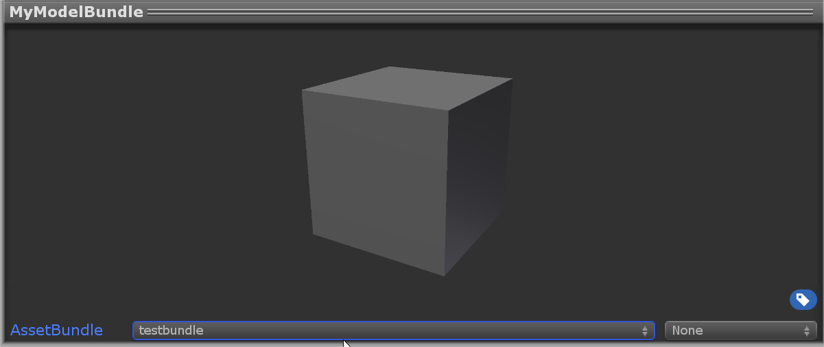
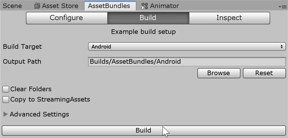
In order to create one, we need to first create a normal AssetBundle in Unity. Simply create a prefab (or use an existing prefab) based on what you wish to upload as an AssetBundle, and using the AssetBundleBrowser made with Unity, build it and upload it as an asset in the AR Experience window, like so.
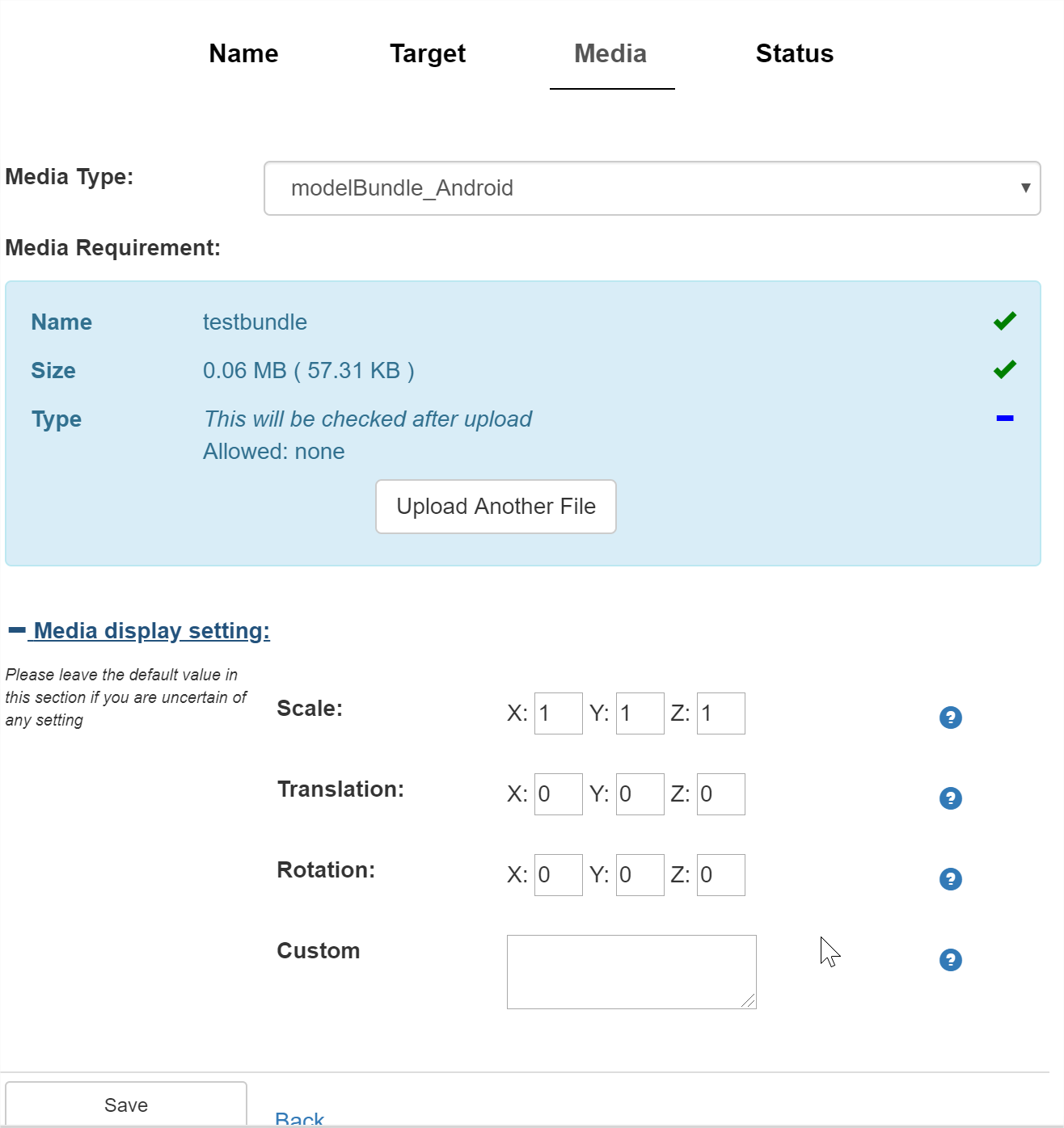
Do note that the Custom field can have either blank, “Standard” or “AR”. By default, this will give a popup in the application, prompting the users to change mode.
Since we are using this AR Experience in a “non-conventional way”, the Target Image will not be used for scanning a target like in the ArDemo, but will will be using its content to display it as a thumbnail in the ModelBundle selection tab. We usually would use a screenshot of the 3D Model as it is in the Editor until we make a proper thumbnail for it.
Once done, publish the Experience. We now need to set up the learn data associated with this ModelBundle.
2.3 – Learn Module Setup#
The Learn Module is divided into two parts:
-
An advanced tree-shaped node system displayed in a hierarchy
-
An analytics system to track students learning
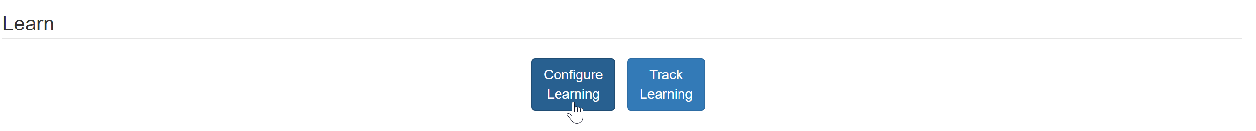
We will only be using the first one, as it is where we will be storing the information of our ModelBundles and label content. To access it, simply click on the Configure Learning button.
You will be greeted with a root node, as well as several fields and tabs.
The hierarchy of your Learn Data is on the left. We will be re-arranging it slightly differently so we can manipulate and display the data in an experience-friendly way.
The rest of the fields are data that will be coming down in the application and displayed. For this sample project, we will only focus on Details, but it is possible to have nodes form relationships with others using the Antagonisers and Associations, as well as Categories and Proficiency Levels which can be used for the Assessment and Q&A EMS modules.
You can manipulate the Learn Data by right-clicking on a node and adding children nodes. For this sample project, be very accurate with the name being displayed in the hierarchy, since we will be using it to bind it with an AR Experience asset later on. The name can be changed in the Name field. Each node name should be unique within its hierarchy.
For the structure we’ll be using in this sample project, each child node of the Root will represent the data of a ModelBundle and will be bound to an asset by name. Think of it as a folder.
While it is not mandatory for all nodes to contain this information, we are using two main Node Properties for our nodes: Label and Body Text.
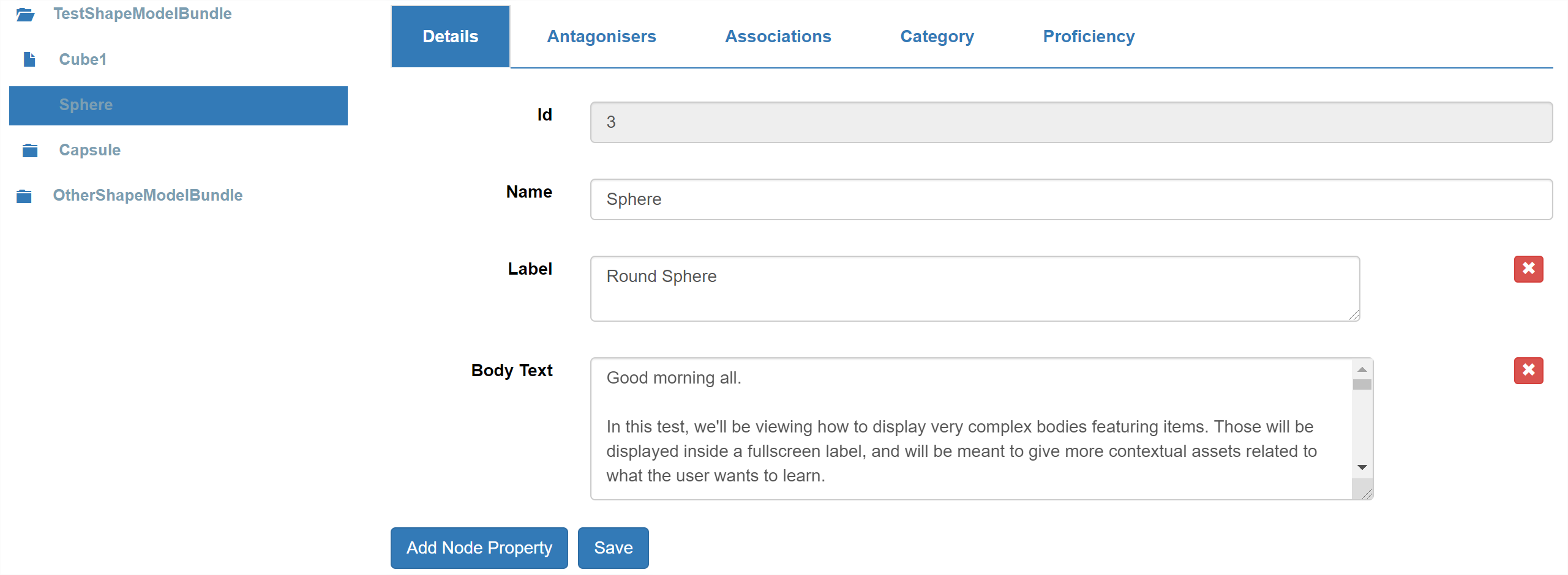
The Label field will replace the Name field when displaying the node’s name on a label.
The Body Text will be the content displayed inside the Fullscreen Label which will appear when the user clicks on a label.
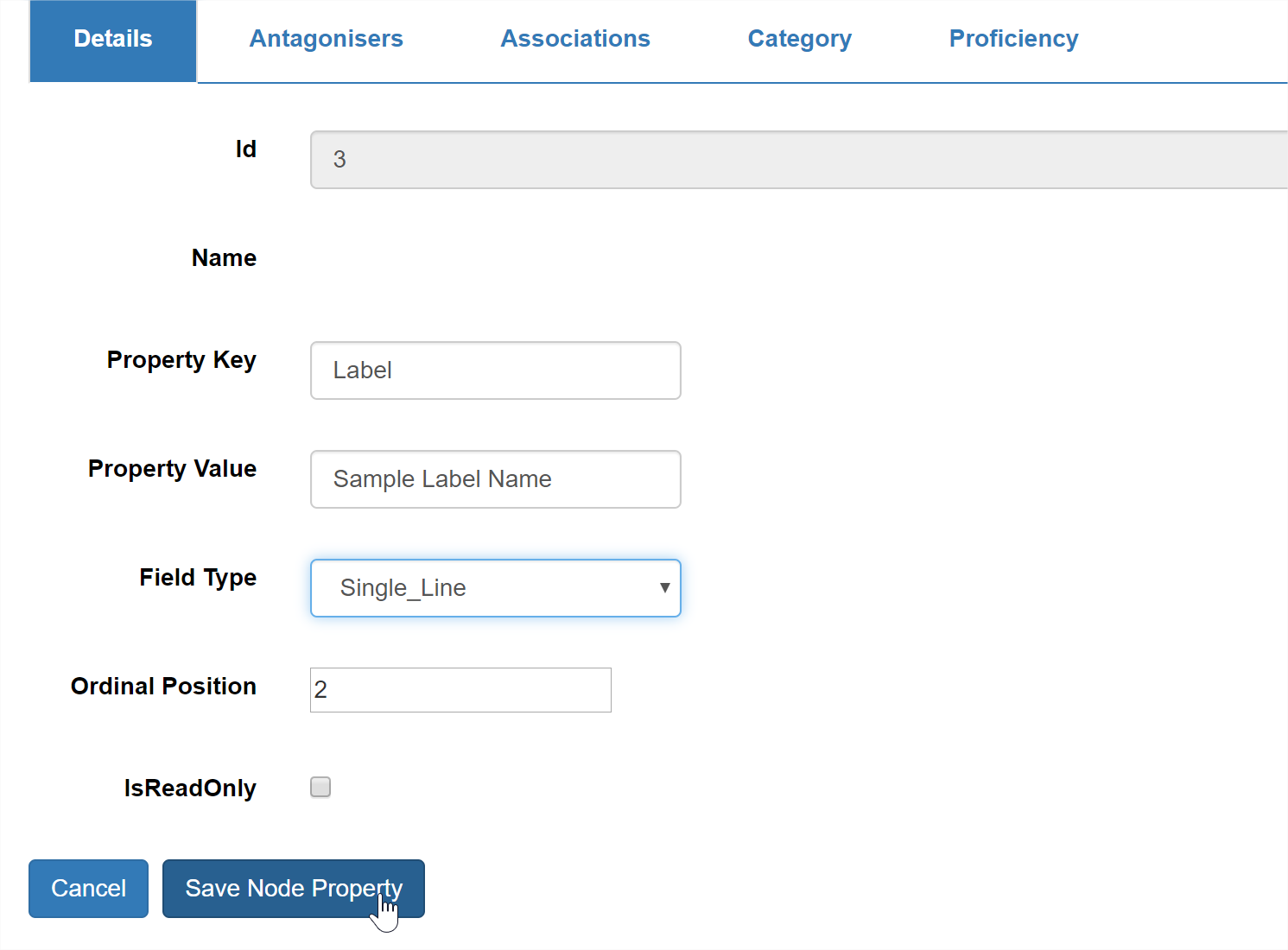
Those node properties may not appear by default. To add a node property, click on the Add Node Property button, and fill in the details, like so:
-
The Property Key corresponds to the Node Property name, both displayed and in the data. It should be consistent across all your nodes.
-
Property Value represents the default value that will be given this property.
-
Field Type corresponds to the type of display you want to use in the editor.
-
Ordinal Position corresponds to the order this property should appear in the editor.
-
IsReadOnly defines whether or not you want to allow users (including yourself) to be able to change its value in the editor. If true, it will have the property value by default.
Do keep in mind that the hierarchy of your node tree (starting from the child of the Root) will be the one used to represent your ModelBundle. By default, the names of all the nodes need to match the names of all the GameObjects. If a name is incorrect, its mesh will be greyed out.
2.4 – Testing your new ModelBundle and its data#
Now that you have created both the ModelBundle and its Learn data, you should be able to test it in application.
Lastly, make sure that you profile is setup correctly. If you have any doubt on how to achieve this, check the 01-Introduction Tutorial scene located in Appearition/Examples/Tutorials/01-Introduction.
If the Experience and the Learn node name match correctly, you should see an entry appearing in the selector when launching the application in the editor.
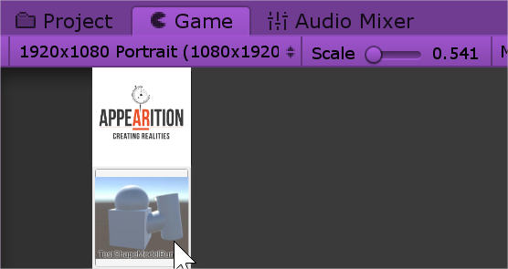
Do note that the selector is a button, you can click it to open and close it at any point in time. If you click on the button showing your Target Image as a thumbnail, you will be able to view your ModelBundle.
If your ModelBundle is too small for some reason, you can change its scale by editing the scale values in the AR Experience media settings of your ModelBundle media.
If you set your Custom Field to AR, you will get a popup window which looks like this:
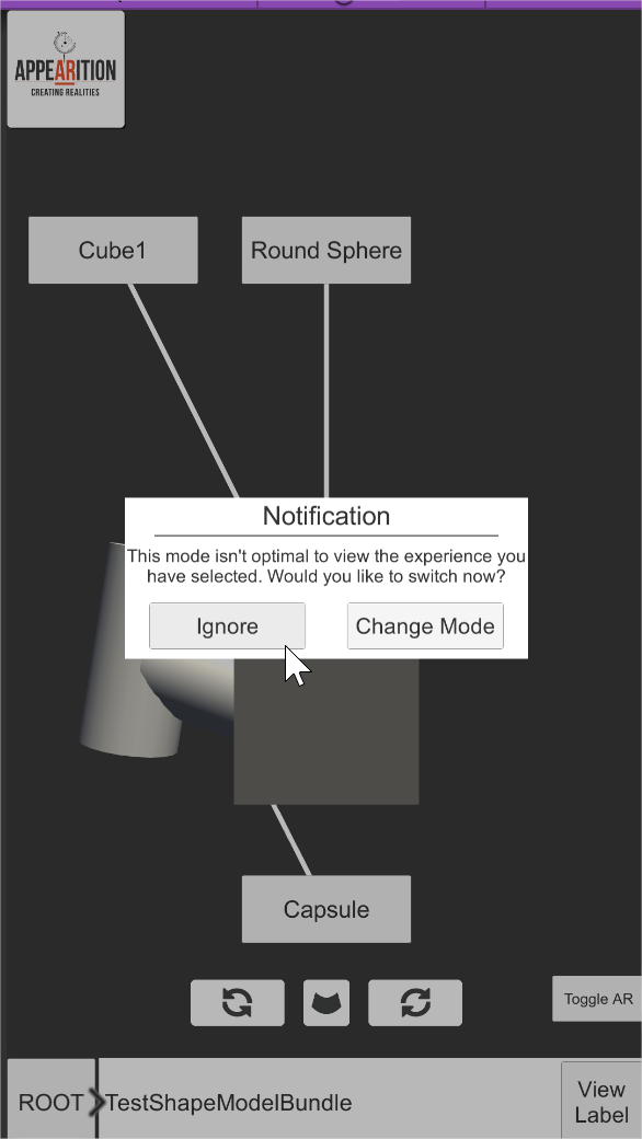
Since we are in editor mode, the markerless AR functionality will not work, so we can click Ignore for now.
You should be able to manipulate the model around and navigate through the nodes you have created.
If you are unsure about how to manipulate or navigate through the model, refer to 1.2 – Test the project. Additionally, you should be able to view your label content normally, although it should only contain text for the time being. Next, we will see how the label system works, and how you can embed medias inside your labels.
3.0 – Understanding the Fullscreen Labels#
There are two types of labels: floating/static (those will be referred as static in this documentation) and fullscreen expanded.
In this sample project, static labels are the small labels containing only the label name of the node and serves as a button to show the fullscreen label. You may extend it so that it shows more information or displays more features.
The fullscreen label is the main label that we populate with data. The idea is that when we pick a node which interests us, we want to see more detail about it, and expand it.
3.1 – Label tag system#
To include more data inside our labels, we are using a tag system. The syntax looks like the following:
-
[[TOGGLE=ToggleList;ITEM1=item1;ITEM2= item2;ITEM3= item3]]
-
[[ASSET=AssetReference]]
-
[[NAME=ButtonDisplayName;ASSET= AssetReference]]
Do note that some of those use asset reference to medias attached to the same asset as the ModelBundle (ASSET tag), and some use simple text manipulation with extra features (called NOASSET).
All of those are called LabelMedias, and are located under Appearition>Examples>MarkerlessLearnDemo>Resources>LearnPrefabs.
3.2 – NOASSET label tags and text formatting utility#
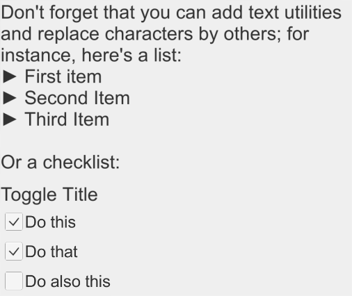
As part of this sample demo, there are two main features which corresponds to this description:
-
Text LabelMedia, which can handle formatting, whereby you may want to replace symbols by others for the sake of making the text look more interesting. It will be used to represent any body text.
-
We replaced the “-“ symbol by an arrow for lists.
-
-
Toggle LabelMedia, where we want to display a list of toggles like a to-do list. We added the capability to remember the choices made by storing them in the PlayerPrefs.
In your application, these Label Medias look like this:
We will cover how to add more NOASSET LabelMedia in 5.2 – Label Media implementation.
3.3 – ASSET label tags and their media
There are ways to implement media and their preview inside the fullscreen labels. Before we create new media on our Experience, here are a few points to keep in mind:
-
Referencing uses the ASSET keyword and looks for a media which has a CUSTOM field with the same text.
-
The media need to be attached to the same Experience as the ModelBundle.
-
The main reason behind this is so that all Label Media related to this ModelBundle start downloading / loading when the ModelBundle is selected.
-
It would be very expensive in term of data for the users to download all the files of each media when opening the application, and would be unnecessary as well.
-
-
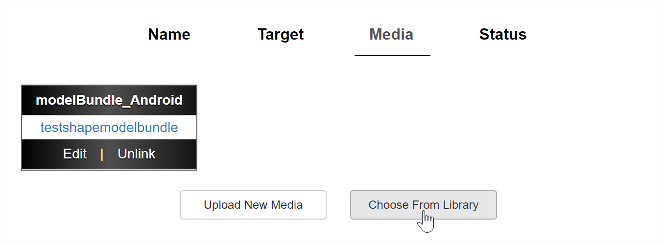
If different ModelBundles use the same media, upload it once and then click on the Choose From Library button when wanting to use it again.
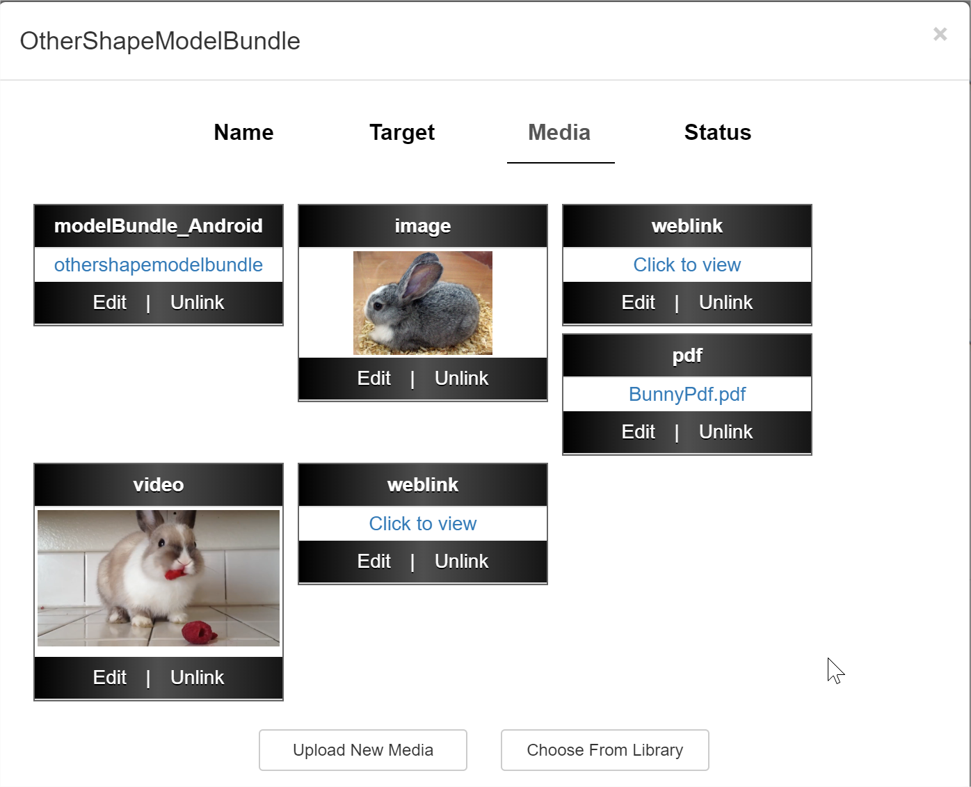
By default, this sample project contains the following MediaTypes, each with different requirements:
-
Image -> [[ASSET=CustomFieldText]]
-
Video -> [[ASSET=CustomFieldText]]
-
PDF -> [[Name=ButtonText;ASSET= CustomFieldText]]
-
Weblink-> [[Name=ButtonText;ASSET= CustomFieldText]]
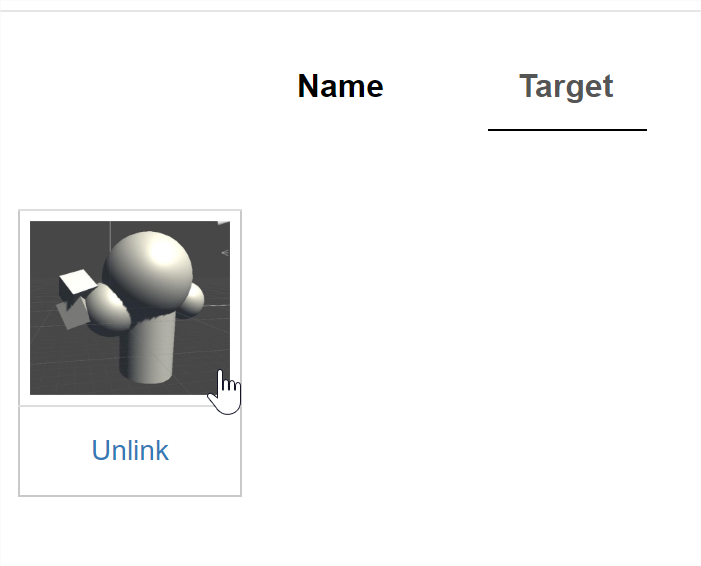
For example, here is a sample experience filled with media, along with the Learn node’s label body text:
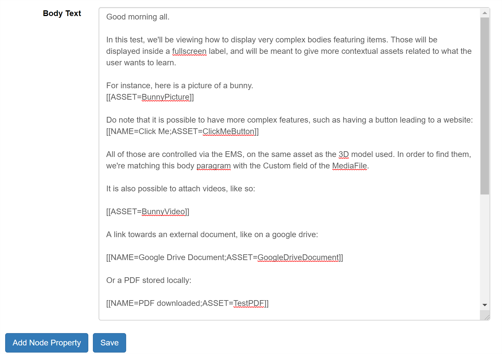
And here is how it looks inside the application:
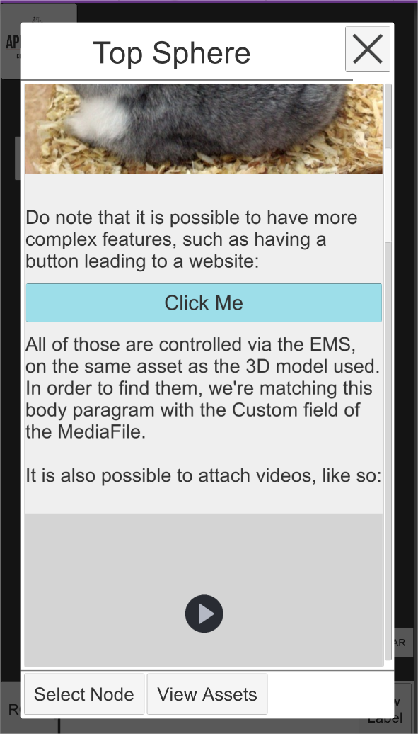
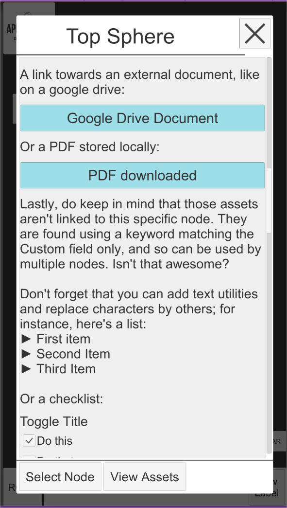
We will cover how to add more ASSET LabelMedia in 5.2 – Label Media implementation.
4.0 – The structure of the Markerless Learn Demo#
The structure of this sample project can be quite intimidating and complex, but has been built to be expanded.
4.1 - Handlers and their roles#
Each functionality of the Markerless Learn demo is divided between several Handlers, for the sake of modularity. Each handler may have dependency on others, of course. The list goes as below:
| Handler Name | Dependencies | Description |
|---|---|---|
| Appearition Learn Demo Handler (ALDH) | None | Main application handler, and core sample project script. Application entry point. |
| Input Handler (IH) | None | In charge of interfacing the current input system. Handles touch, double touch, etc, and creates events for them. |
| Markerless Mode Handler (MarMH) | ALDH | Handler in charge of managing the transition between the Standard and Markerless modes, as well as holding the references and functionalities related to each mode. |
| Model Navigation Handler (MNH) | ALDH | In charge of the Node Navigation, allowing the user to explore childrens and parent nodes. Handles that logic. |
| Node State Handler | ALDH | Takes some work away from MNH. In charge of telling what node should be visible, transparent or hidden, and when. |
| Model Manipulation Handler (MMH) | ALDH | Allows translation, rotation and scaling of the current model. |
| Model Visual Handler | ALDH | Contains the default materials to be applied onto every node with a mesh. Do note that those can be overrode by a Node Component. |
| Node Label Handler (NLH) | ALDH | In charge of gathering the information of each label, and which to display. Additionally, contains utilities related to label body text. |
| Standard Label Ui Handler | NLH | In charge of displaying labels for the standard mode. Reports back to NLH. |
| Markerless Label Ui Handler | NLH | In charge of displaying labels for the markerless mode. Reports back to NLH. |
-
IH
-
MarMH
-
MNH
-
MNH
-
IH
-
MarMH
-
MNH
-
MarMH
-
MarMH
Each of these managers and handlers communicate between each other only via events, making the flow much simpler and predictable. Additionally, the UI system is fully detached from the rest of the code and can be dropped as a prefab with only the AR Camera as a connection to make.
4.2 – Settings and constants#
In order to give a maximum amount of customization, the settings have been divided in two categories: editor and constants.
Editor values are meant to be changed and tweaked, while constants are meant to be rules that you want your application to follow. All AppearitionGate and SDK-related rules are present in the AppearitionConstants, while the constants specific to this sample projects are located in the AppearitionLearnConstants.
These constant settings contain information such as:
-
Directory paths
-
Keyword and defines
-
Media, MediaType and Label rules
-
Node Navigation and Model Manipulation rules
Before making any changes to the code, it is recommended to check what settings are already available; they might save you a lot of time.
4.3 – Mixed Appearition Asset#
The MixedAppearitionAsset is the main storage used in this sample project. If you have worked with the Location Demo, you are most likely familiar with it.
The point of the MixedAppearitionAsset is to contain all the data (both cloud and runtime) inside a single component container. This script is also in charge of the initialization logic of an asset regardless of how many modules it requires.
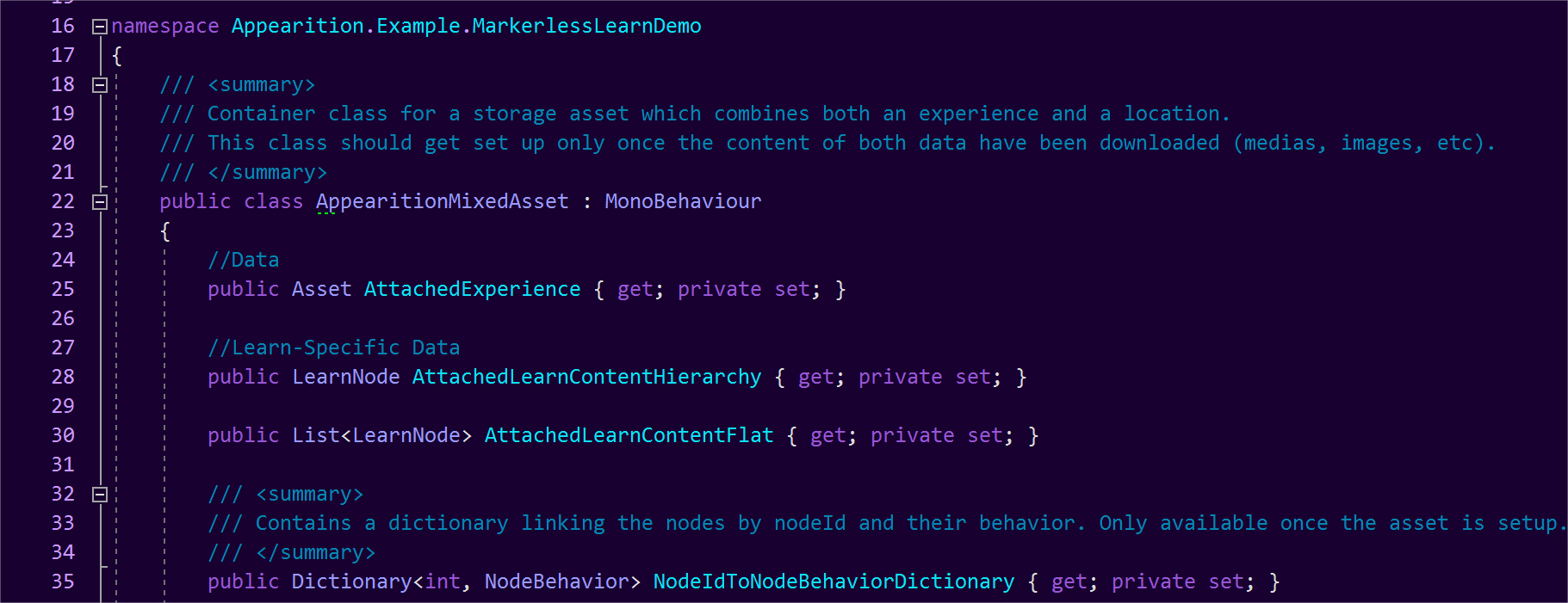
Do note that all the active AppearitionMixedAssets, as well as events related to those, are located on the AppearitionLearnDemoHandler. This also includes the storage of the current asset being viewed, as well as events which get triggered when swapping assets.

4.4 – ModelBundle components#
In order to further customize ModelBundles individually, consider adding components to be used upon loading complete. For instance, it is possible to override the material behavior used by the ModelBundles, as well as provide different materials instead of the defaults.
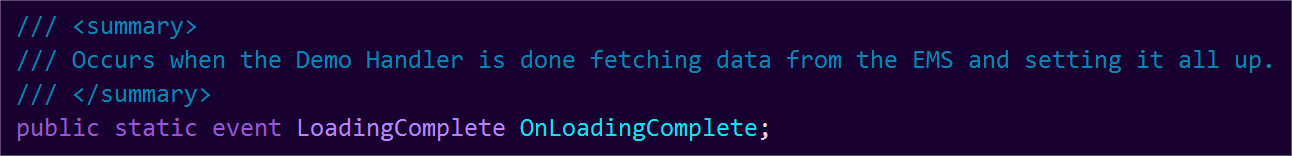
Binding to this event located in the AppearitionLearnDemoHandler will allow to
We will cover the material system in 4.7 – Material System.
4.5 Learn data implementation variants#
Depending on the type of ModelBundle, client or data, you might not be able to have your ModelBundle’s hierarchy perfectly match the Learn Data.
Because of that, the way the ModelBundle and the Learn Data are combined has been abstracted, and it is possible to add a different way to bind the ModelBundle to the Learn data content.
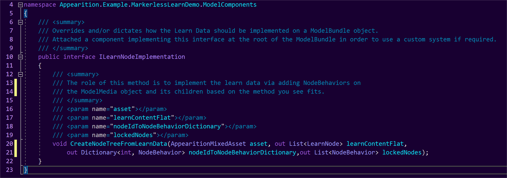
By default, the LearnNodeImplementationPreparedHierarchy will be used. In order to override it, add a component which implements ILearnNodeImplementation at the root of the ModelBundle.
The second choice which has been implemented is LearnNodeImplementationFlatHierarchy, which assumes that all the GameObjects that can be used are direct children to the ModelBundle. The Learn Data will find each based on their name and create the hierarchy based on its content.
4.6 Node Components#
While the implementation of ModelBundle components and features are pretty open, we created a structure for the Node Components. Those components need to be present on the GameObjects prior to building the ModelBundle, or are generated during the implementation of the Learn Data on the ModelBundle.
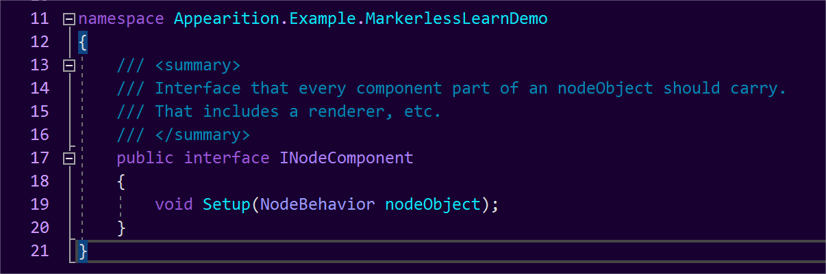
Each Node Component need to implement the INodeComponent interface, in order to be triggered when the Node is finalizing setup and to receive a reference of said node.
An example of a NodeComponent that gets generated during runtime is the NodeColliderBehavior, in charge of turning on and off the colliders during model manipulation. The reason why this component exists is to save performance when manipulating highly complex models with thousands of colliders. Do note that this feature can be disabled.
Additionally, it is possible to add required NodeComponents in the AppearitionLearnConstants by adding its type inside the MandatoryNodeComponents array.

4.7 – Material System#
By default, this sample project gives a special treatment to the Renderers of the ModelBundle in order to optimize it. All renderers will be sharing the same material per state (visible, highlighted, etc), and the default materials can be set in the ModelVisualHandler, which sits on the main manager GameObject.
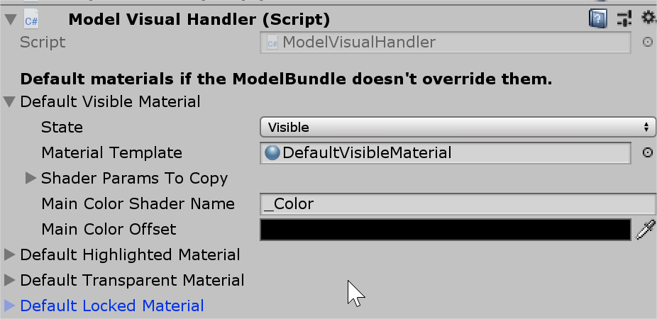
However, it is both possible to override those settings for a single ModelBundle, or to fully disable that feature and leave the materials intact. In order to do that, the ModelBundle needs to have the ModelBundleVisualOverride component at its root, with the desired information entered in the editor.
This system has been made to optimize very complex models to avoid a high amount of draw calls, and may not be necessary in every case scenario.
4.8 – Standard VS Markerless labels#
The handling of the label system stands on two levels:
-
The NodeLabelHandler defines what node should have their labels displayed, and delegates the displaying to a BaseLabelUiHandler.
-
Based on the mode, a BaseLabelUiHandler will be displaying the labels.
For instance, in the Standard mode, the StandardLabelUiHandler is in charge of displaying the labels on a static grid with a capacity of 6 labels. It contains the logic as for what label should be connected to what node.
When switching to Markerless Mode, it is more natural to have labels floating in space, hence the need for a second handler. The MarkerlessLabelUiHandler will be handling the display of those different labels.
In the case of both of those label handlers, the same script is used for the behavior of a label: LabelContentUiBehavior.
If you want to change the way labels are being displayed, you can freely change the display logic per mode, or you are free to create a new mode which will handle it.
5.0 Media, labels and expanding content#
As mentioned before, the core system of this sample project was built to be expanded into a fully-fledged app. While there are only 4 MediaTypes implemented at this current point in time, you can add more and/or change the way existing ones are displayed.
Please contact Appearition Support to enable more Media Types and the creation of Media Types for your account.
We will be going through the implementation of Medias both on a label and display level. Do note that each MediaType needs to be implemented in both sides in order to work properly.
5.1 – General Media implementation#
If you have worked with the ArDemo or the Location Demo, the implementation will feel very familiar.
The way we are handling the implementation of MediaTypes is by creating a new class which implements the ILearnMedia interface. The name of the class should look like MediaTypeLearnMedia. Do note that the first letter is uppercase in the class name, but not in the MediaType name (eg ImageLearnMedia).
Unlike other sample projects, ILearnMedia only define the way they will be shown fullscreen if clicked while viewing the fullscreen label.
There are two ways to have a MediaType to be picked up in the EMS:
-
A Prefab will be found under Resources>LearnPrefabs with the exact name of the MediaType. This prefab should contain a class which implements ILearnMedia at the root.
-
A class will be found with the name MediaTypeLearnMedia.
Please refer to existing MediaTypes for more example. Do note that if your MediaType requires a canvas, you can save time by having it inherit from BaseCanvasLearnMedia and automatically will be receiving canvas and scaling functionalities.
5.2 – Label Media implementation#
This section applies for both ASSET and NOASSET Media.
If the Media is of type ASSET, its label implementation needs to inherit from BaseFullscreenLabelMedia.
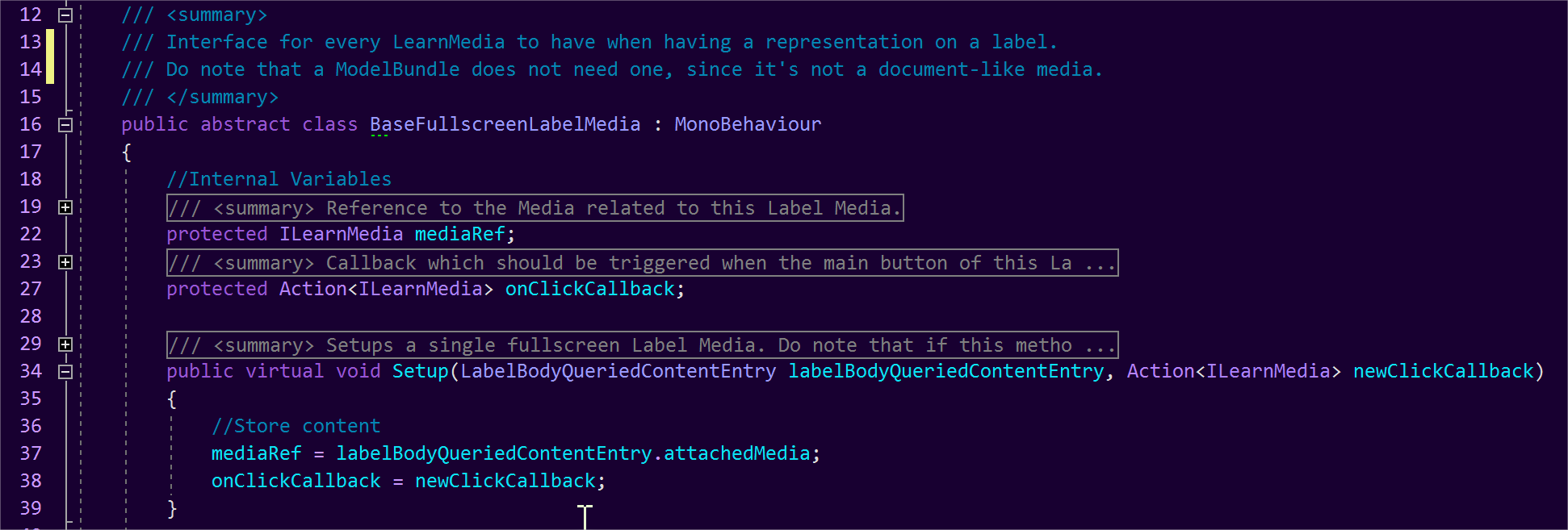
If the Media is of type NOASSET, its label implementation needs to inherit from BaseFullscreenLabelTextMedia.
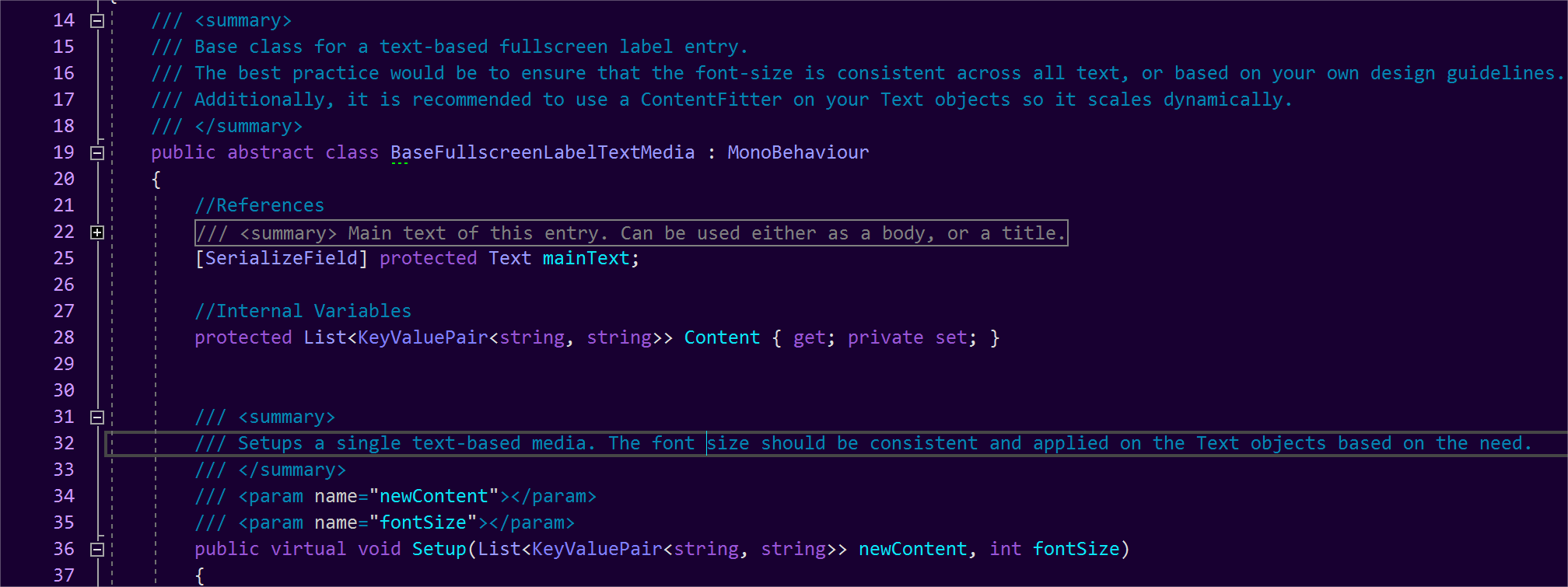
Additionally, regardless if ASSET or NOASSET, the label implementation requires a prefab located in the folder Resources>LearnPrefabs, and the name should be called mediaType_fullscreencontent.
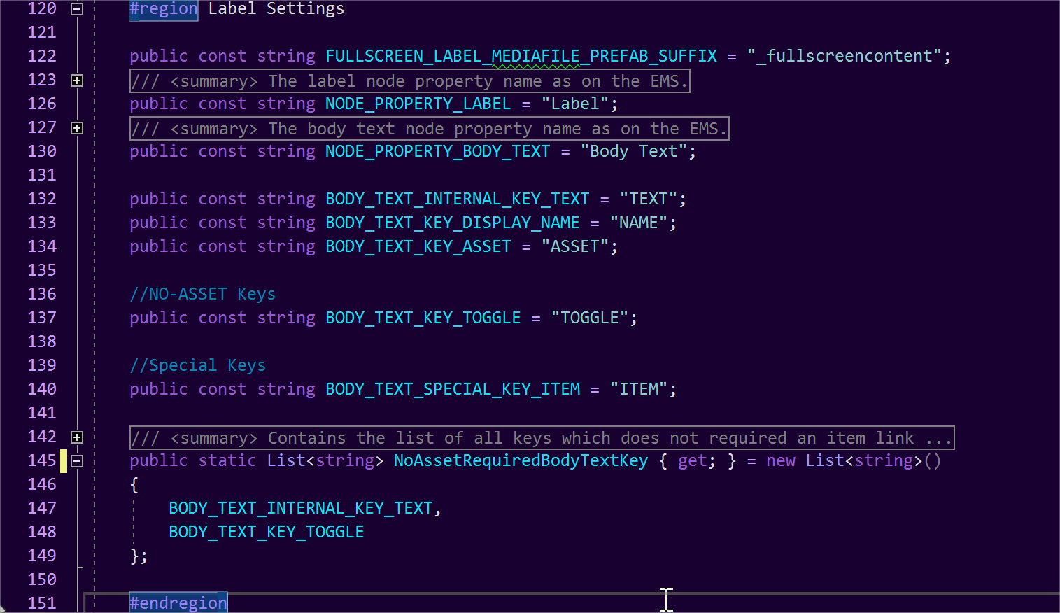
Lastly, when creating more NOASSET Media, make sure that their keyword is present inside the NoAssetRequiredBodyTextKey list located in AppearitionLearnConstants. It is recommended to keep any new keywords at this location.
Lastly, here is a summary of where to find the main features of the Markerless Learn application.
-
Most settings, rules and keywords can be found in AppearitionLearnConstants.
-
All Markerless functionality and handling can be found in MarkerlessModeHandler.
-
The main life-cycle events can be found in AppearitionLearnDemoHandler.
-
Any functionality, utility and events related to nodes can be found in ModelNavigationHandler.
-
The handling of displaying labels is split between the StandardLabelUiHandler and MarkerlessLabelUiHandler.
-
The logic which defines what node is to be visible, transparent, highlighted or hidden is in NodeStateHandler.
Thank you very much, have a wonderful day and happy deving!